THE FIELD / DESIGN LANGUAGE
A quiet field that grows itself.
Galok is a personal magazine built like a field. Its design rules are not decoration: they are the way one person learns to see — and the way that seeing is shared with strangers on the other side of the internet.
View · Frame · Observe
01 / PHILOSOPHY
The field grows first. Design serves the growth.
Three laws, one inheritance. Every page, typeface and motion rule below descends from them.
The design should feel like something a plant would choose: unhurried, layered, alive at the edges. Restraint is not emptiness — it is room left for growth.
Color, type and motion exist to carry an argument, a city or a memory. If a visual cannot be read, it is decoration and decoration is removed.
The palette stays within three colors. Motion stays within one breath. Angles stay right. Discipline is what makes the field legible across years.
View
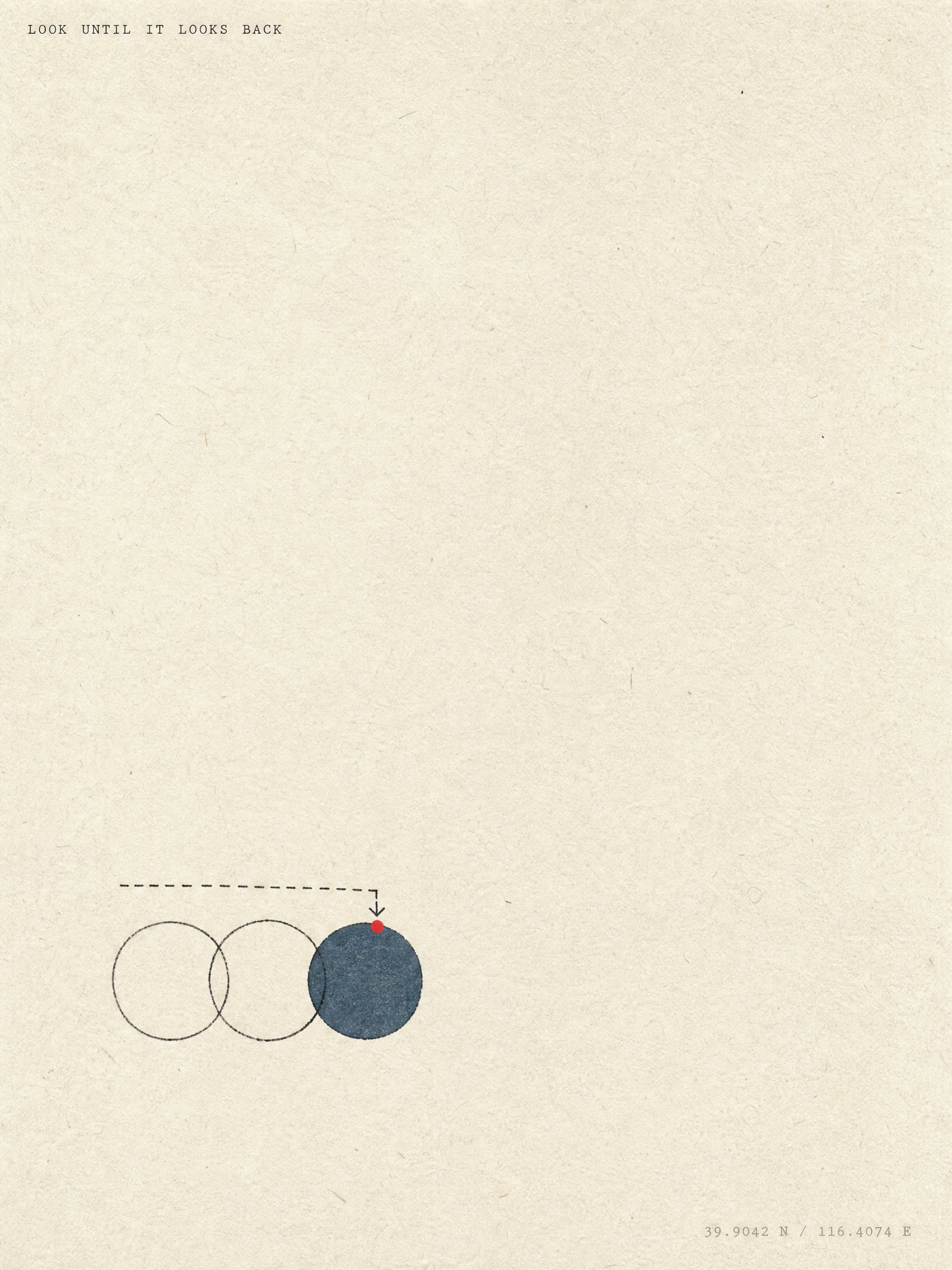
The wide stance. Stand back until the whole field is one image: a page, a city, a dataset.
39.9042°N / 116.4074°EFrame
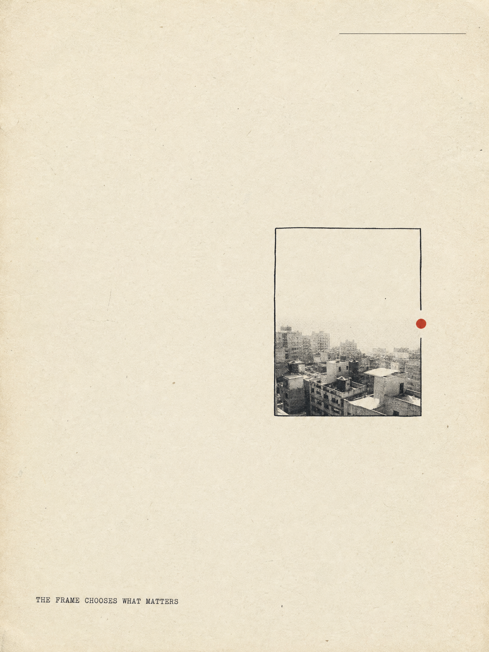
The editor's cut. A frame is a claim: this matters, and that does not. Every chosen crop is an argument.
ISSUE 02 / CITY 05Observe
The long stay. Look until the subject looks back — until the pavement, the ledger or the light returns something only patience can see.
PLATE 04 / FIELD NOTE02 / PALETTE
Three colors and their weather.
Near-black ink, warm paper and one signal red hold the whole field. Deep blue, gold and green appear only inside their own territories.
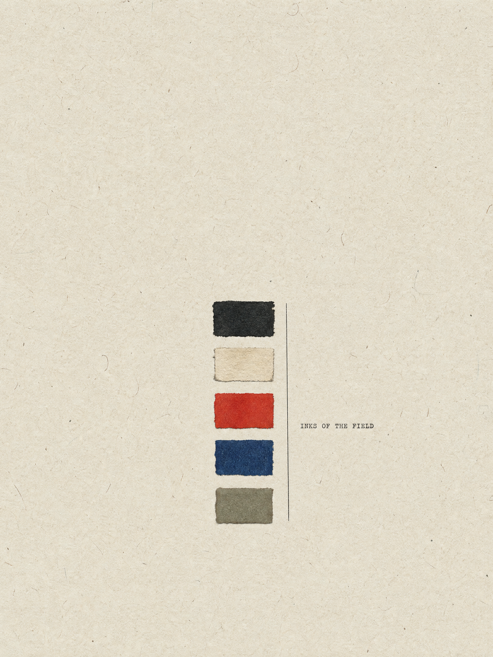
ATHE SHARED THREE / 三色共享 — every page carries these three, no exceptions.
BTHE RESERVED THREE / 领域保留 — appear only inside their own territory.
CTHE INK GRAY SCALE / 墨阶辅助 — tints of ink, never a fifth accent.
Tap any swatch to copy its hex. The rule: three colors on every page, never more — the signal red appears once per screen at most.
03 / TYPE & MARKS
Four voices, one room.
A serif for argument, a grotesque for interface, a Ming body for Chinese longform, and seal script for the marks that close a piece.
The field grows first.
ISSUE 02 / CITY 05 · PLATE 04
田野自己生长,设计为它服务。
視 框 察
04 / GRID & RULES
White space is the first material.
Twelve columns hold the desktop; the margins are wide enough to walk in. Hairlines divide without shouting. Every angle is a right angle.
The desktop grid. Cards span six; case studies break the rhythm deliberately, once per page.
Content breathing room: 48px gutters at full width, 32px when the view narrows below 640px.
All dividers are one pixel, in #d8d2c8 or ink at 12%. Never a shadow, never a fill.
Everything is numbered and named: ISSUE 02, CITY 05, PLATE 04. Numbers make the archive searchable by memory.
Corners are right or not at all. The field has no rounded edges — paper is folded, not bent.
05 / MOTION
Less than a breath.
Motion exists only as opacity and transform, never above a quarter of a second, and it keeps silent for anyone who asks for stillness.
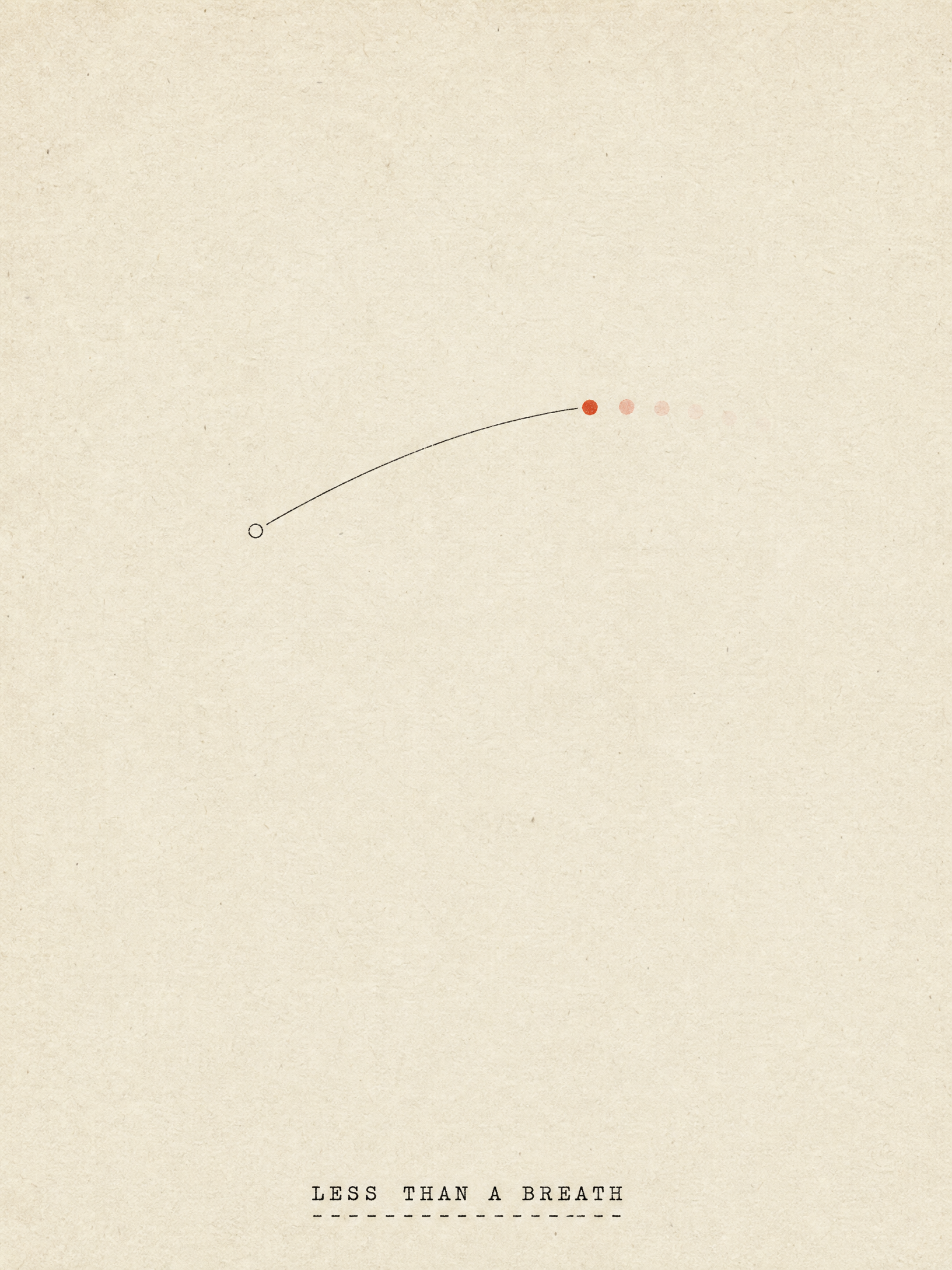
opacity + transform. No width, height, top, left — nothing that forces a layout.
A quarter of a second is the ceiling. Reveals settle at 220 ms; presses at 140 ms.
cubic-bezier(0.2, 0.8, 0.2, 1). Things arrive and stop; they never bounce.
prefers-reduced-motion turns every transition to instant opacity — respect is a design rule.
06 / ASSETS
The tools of the field.
Everything below is live on this site. The posters are made by the same rules that make every page: one event, one color, wide paper.
- Stylesheet
- /styles.css — the constitution. Colors, type, motion, components.
- Archive system
- /archive-system.css + .js — hero, sections, cards and the three lenses' shells.
- Brand mark
- /assets/galok-symbol.svg — the glyph that signs every page.
- Seal font
- /assets/fonts/yishanbeizhuanti.ttf — seal script, self-hosted, for the closing marks.
- Zine posters
- Minimal 3:4 paper works generated from the field's own prompts — see the gallery.